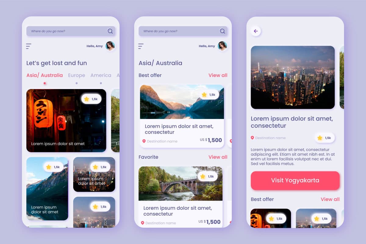
1. Mobile Traffic Is the Default, Not the Future
In 2025, over 65–70% of global web traffic comes from mobile devices. For millions of users—especially in emerging markets—mobile is their only computer.
A mobile-first strategy ensures your product performs flawlessly where your users truly are.
2. Google’s Mobile-Only Indexing Is Now Standard
Google now ranks and indexes only your mobile site.
That means:
Poor mobile UX = poor SEO
Slow loading = low visibility
Complex layouts = bad Core Web Vitals
Mobile-first directly boosts discoverability and ranking.
3. Screen Diversity Has Exploded
2025 brought more unique screen types than ever:
Foldables (Galaxy Z, Pixel Fold)
Flip phones with tall ratios
Tablet-desktop hybrids
Wearables with micro UI panels
Mobile-first ensures your layouts expand outward with stability and fluidity.
4. Performance Expectations Are Much Higher
Users now expect:
< 1s meaningful interaction
< 100ms UI response
Smooth animations
No layout shift
Designing mobile-first forces teams to:
Optimize images
Reduce JS
Use efficient animations
Prioritize clarity
The result: a UI that feels instant.
⭐ What’s New in 2025?

1. AI-Assisted Responsive Layouts
Frameworks like Next.js 15, Astro, Qwik now integrate AI helpers:
Auto-generated layout variants
Device-aware scaling
Gesture-smart components
Mobile-first + AI = faster, smarter adaptation.
2. Design Tokens Are Now the Core of UI Systems
Spacing, radius, type, colors, breakpoints—everything runs on tokens.
Starting with mobile tokens makes scaling to desktop predictable, not chaotic.
3. Mobile Gestures Influence Desktop UX
Swipe, long-press, drag-to-reveal—these mobile gestures now appear in desktop interfaces too.
Users want mobile simplicity everywhere.
How to Implement Mobile-First Design in 2025
1. Start With the Smallest Screen
Design for:
360px
Single-column layout
Only essential actions
Clear hierarchy
Mobile-first forces prioritization.
2. Build Upwards (Progressive Enhancement)
Enhance step by step:
Mobile
Tablet
Foldables
Desktop
Wide-screen & TV
You enhance — not redesign.
3. Use Modern CSS for Fluid Responsiveness
Essential 2025 tools:
clamp()for typeContainer queries
Grid/Flex hybrid layouts
View transitions
Responsive units (svh, dvw)
Container queries have completely changed responsive design — components adapt to space, not device.
4. Keep Mobile Performance Priority #1
Lazy-load extras
Reduce JS
Use WebP/AVIF
Prefetch on scroll
Fast mobile = fast desktop.
5. Test on Real Devices (Especially Foldables)
In 2025, you must test:
Fold/unfold states
Edge cases
Battery saver modes
Orientation changes
Device testing unlocks real usability insights.
Examples of Excellent Mobile-First UI in 2025
Threads – simple, fast mobile-first interface
Notion – mobile gestures reflected on desktop
Figma mobile – optimized for touch workflows
Stripe Checkout – minimal, fast, reliable
These prove that clarity scales.
Conclusion: Mobile-First Is Now Experience-First
In 2025, mobile-first is no longer about fitting content into small screens. It’s about:
Prioritizing clarity
Removing clutter
Designing for real users
Ensuring speed everywhere
A mobile-first product scales effortlessly upward — but a desktop-first product rarely scales down without breaking.
This is why mobile-first remains the unbreakable standard of modern digital design.


